Showing posts with label text. Show all posts

Monday, 18 November 2013

18/11/13- The Origins of Typography/Text

The third lecture was called the "Origins of Typography", covering languages that had to be learned, rather than interoperated, and the development from abstraction to more complex markings, and the importance of literacy during the different ages. 
And, in all honesty, I found it very difficult to get myself inspired over this topic. I understand the importance of typography, and its relevance in not only communicating an idea in an informative sense but also conveying it on a more pictorial level, but it is not something I have really put much thought into in the past. So I guess it would be best to start with the history.

In previous centuries, before the development of the printing press, books had to be hand scribed, which was both very expensive and time consuming, so typefaces were created which allowed scribes to use a specific set of letter styles to stick to in order to reduce the time taken, as well as making it easier for printing. The original typefaces, like Blackletter, were only really ideal for hand scribing, due to the thick nature of them, so thinner types were created specifically designed for printing called Roman Type, based on the inscriptions on ancient monuments, buildings and temples from the Roman era. After that, in order to keep with the times and demand for more publications, like posters, billboards, fliers and magazines, more simpler geometry based types were invented, like Futura, as well as more creative, specialised and downright bazaar fonts. And with the introduction of enhanced technology came pixel type, as well as the ability for anyone to create their own type styles. This has allowed for a sudden boom in new type faces in the past few decades. 

What especially interests me however isn't the history of typography, but how it is being used today and how constant development allows there to be a future for typography as well. For example, the combination of Typography and other modern mediums, like animation. I have found some of the most effective and convincing advertisements, music videos, and other animated films have included typography using appropriate fonts, timing and movement to create visual impact to emphasise certain points in a sequence.  

This student production (by Tamara Connolly, 2007) of a music video for the song "Feeling Good" by Nina Simone is a fantastic example of the use of animated typography using appropriate timing combined with suitable type, along with graphic elements as well, in order to enhance the impact of the song and it's lyrics. 


What I find especially satisfying about this video is the way the size of the typography itself changed in accordance to the dynamics of the music, for example the use of larger, bolder writing whenever there is a crescendo. It proves that typography isn't just a tool to get people reading, it can be an art form in itself, getting the mind flowing along with the movement of animated pieces like this. Typography has gone through a lot of changes and has morphed into its own art form over the years, and I believe that with the use of animation and film it will continue to develop and grow. 

The font I am currently using to write this blog post is fine- it does the job in providing a legible form for me to write in and for others to read and understand. However, in the words of the American Typographer Ed Benguiat:


“I do not think of type as something that should be readable. It should be beautiful.”  

I think that it depends a lot on the context of the type- when trying to convey something words alone simply cannot do, like lyrics or poetry, I believe there will always be a time and place for creative typography.  
                                  

Monday, 11 November 2013

11/10/13- More On Musical Notation

Some of the earliest forms of musical notation that were discovered in the form of cunieform tablets, and were found in Nippur, Sumer, which is now Iraq, and had been created about 2000 years Before Christ. They seem to use a diatonic scale, using tones that go up in thirds, although the musical language itself used in early examples like Mesopotamian songs are quite fragmented. Many of these tablets found are related to the tuning of a harp like instrument called a lyre, which was frequently used whenever accompanying Babylonian hymns. The lyre itself has become something of an icon in itself over the years, featured in artworks to symbolise gods and wisdom. 


An example of Sumerian cunieform music from 26thc BC,
it is a lexical list of harp strings and
one of the oldest existing examples of written music
The musical markings themselves are nothing like the universal modern day staff notation method, in that today's musical notation can be seen as it's own language, that has to be learned to be understood and conveys instructions to create sound almost exclusively through symbols, while the cunieform markings serve more as indications for the reader to interoperate, written over or under the words of the hymns. 

There have been countless excavations and discoveries of ancient musical writings all over the world, including a collection of Hurrian Songs dating from about 1400 BC, which were discovered in the city Ugarit and use Akkadin musical instructions, which is a now extinct Semitic language that was spoken in ancient Mesopotamia. Ancient Greek papyri writings have also been discovered, which seem to follow a very similar system to the Babylonian texts.

Of course, before the modern staff notation that the majority of musicians use worldwide today, musical notation differed between countries, due to different languages, instruments and culture, and a lot of music was not even written down, and was instead passed down from generation to generation through oral communication.


"Introit Gaudeamus omnus", an example of Gregorian Chant Music, 14th-15th Century
The earliest forms of Gregorian chants used indication symbols called neumes, before
the notation method progressed on to use square notation (shown above),
 a kind of staff notationsimilar to what we use today.

An example of Byzantine church music from Serbia, 18th Century.
A staffless notation method which uses indication marks to show change in pitch, kind of like
musical punctuation.

Modern Day Staff Notation
It is read from left to right and each horizontal line marks a whole tone
while the horizontal "bar" lines give a musical piece structure.
The notes themselves vary in appearance depending
on their length.

It seems that due to the invisible nature of music, the symbols developed to communicate musical instruction are not pictorial but rather mathematical, using certain lines to indicate change in tone and duration of notes. I think the wonderful thing about music is that it seems to bridge the gaps between science and art- by using a logical and mathematical language we are able to share and express ourselves through pure sound.  With the different variations all over the world and the progression of symbol development, believe that music is a language in itself.

Sunday, 27 October 2013

27/10/13- Kanji Pictorial Origins

The idea of languages developing through abstraction of an image immediately made me think of the pictorial nature of Kanji characters, a writing system that has Chinese origins but was adopted into the modern Japanese writing system after being introduced to these characters over the years through coins, seals, weapons and decorative items imported from China. The specific origin of these symbols is still questioned to this day, and there isn't one official answer yet, however it is known that Kanji is the result of pictographs and the simplification of images, and the oldest kanji symbols have been found on animal bones and tortoise carapaces as inscriptions dating from around 1700BC-1100BC, during the Shan Dynasty. Of course, these characters have changed a lot over the centuries, and once they were adopted into Japanese culture they went through even more changes subject to further simplification of symbols, a difference in meaning and the addition of characters invented in Japan. The idea, however, remains the same- single symbols or a combination of several symbols used to represent objects, ideas, and actions into a simplified writing system.

Due to the fact I have previously studied a little of the japanese language in the past, I was aware of some of the more commonly used kanji characters having directly pictorial origins, and with the use of this very useful children's learning website: http://web-japan.org/kidsweb/language/quickkanji/index.html I was able to illustrate some of the most obvious abstractions.


While you would not immediately think "fire" or "sun" if you viewed these symbols independently, the meaning becomes clear when the progression of abstraction, or continuum, is also provided.


 I find the symbol for "tree" especially interesting, because while it is one of the most obvious symbols, it can be seen in more than one way: some see the horizontal line representing the earth, with the tree above the ground and the three "roots" below the earth, while others see the entire symbol as the tree with the horizontal line representing the upper branches, and the sweeping lines below it representing the lower limbs. It is also quite satisfying that the symbols for "woods" or "forest" are simply the tree symbol multiplied, which is very easily understood by anyone learning the language. 


The kanji for rice paddy is rather obvious; the one for fish is not. That gives me the idea that the kanji for fish actually is the simplified version of a sketch someone made of a fish, due to the fact that fishes differ in appearance.   
                                                    

While Kanji is based on pictographs, there is a lot more to this writing system, such as the combination of characters to derive a different meaning. There are a few ways of doing this. 

Simple Ideographs
These are symbols that are used to represent directions and ideas that do not have a direct image to derive from.


Compound Ideographs
The characters for "woods" and "forest" are compound ideographs- more than one symbol placed together to form another character. There are countless combinations with many different meanings.


The above example is the Kanji for rest, which is the combination of the character for "man" and the character for "tree" representing a person leaning against a tree, therefore taking a rest. From what I have seen, the origins of compound ideographs are pretty logical like this.

Derivative Characters
These are more indications than actual symbols; more like characters that relate to an idea rather than directly represent it. 


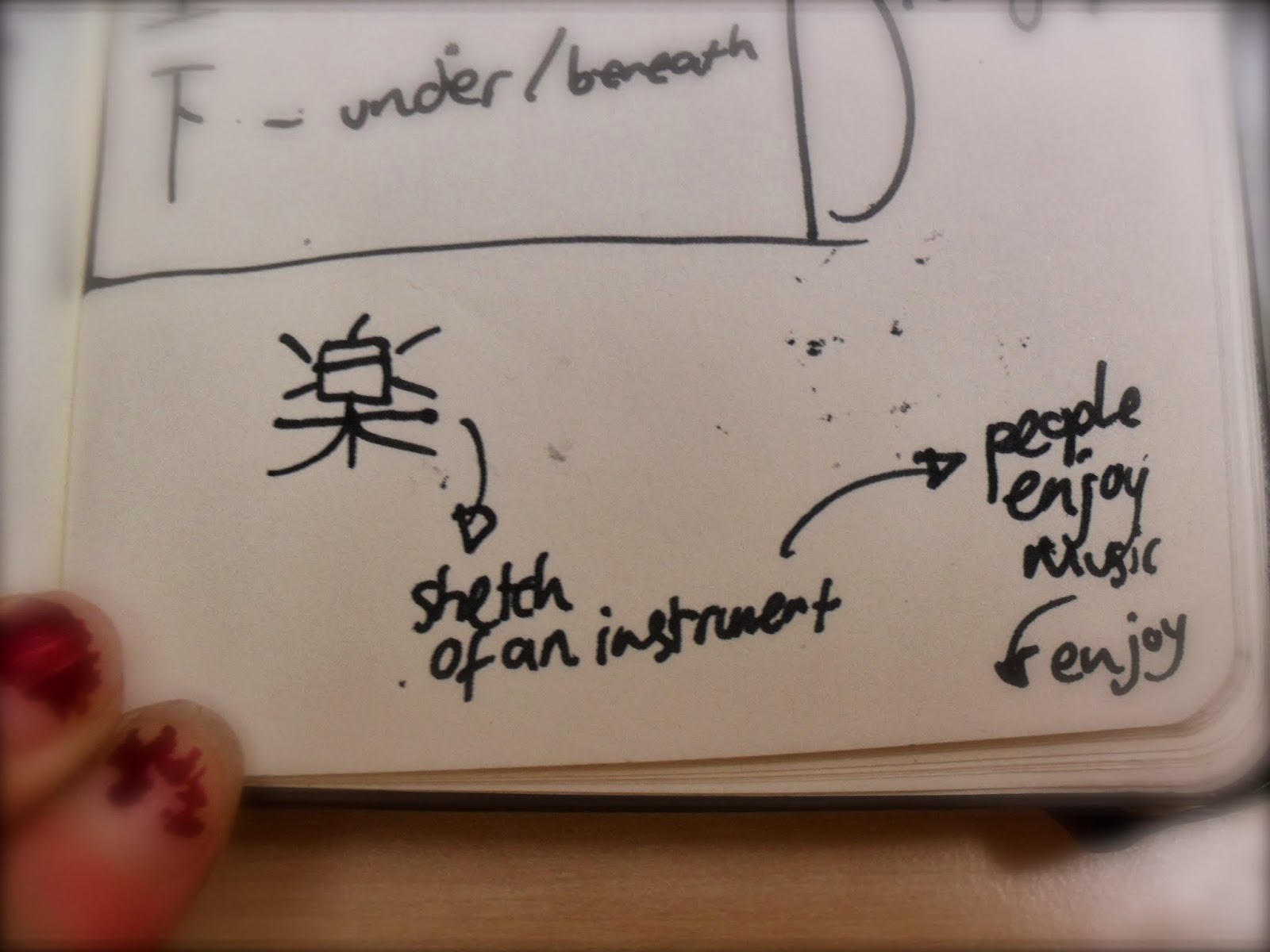
The above character means "to enjoy" however, because there isn't a pictorial representation of that, we have here in stead an abstracted version of a sketch of a musical instrument, and because people enjoy music, this symbol therefore can be derived to mean "enjoy. 

I personally find Kanji fascinating, as not only are there hundreds and thousands of characters with different symbolic qualities, but even more combinations of characters to be learned. 

Tuesday, 8 October 2013

08/10/13- The Initial Lectures


Week 1
So far we have had three contextual lectures, illustrating the progress and development of human communication starting off with “The Birth of Symbolic Language”, from the very beginning of human existence, right through to the idea of online personas, texting and emailing, so I think it’s fair to say we covered a lot. What particularly captured my interest initially was the Chauvet Caves, examples of prehistoric cave art which were open for interpretation- while some believe they are informative and for descriptive uses to convey lessons in hunting, others see them as evidence that the early homo sapiens were not in as much danger as it is commonly conveyed, and they had time for storytelling and had the capacity for fantasy and imagination. Meanwhile, it was pointed out that the more abstract and symbolic Bhimbetka Cave Painting in India displayed signs of possible ordering and maybe even the concept of movement, or “animation”. This made me think of the 2003 Disney animation “Brother Bear”, which seemed to have picked up on this idea. It contains several scenes where the animal spirits, styled around the imagery in famous cave painting sites, are seen in the northern lights and are spiralling and circling, much like you would imagine the cave paintings to move. It is pleasing to think that ideas and images that were not possible to express thousands of years ago are now being conveyed countless generations later, using the resources we now have.
Chauvet Cave, FranceVery pictorial and descriptive,
with 13 types of animals in total

Bhimbetka Cave Painting, India
Symbolic and abstract, possibly markers
for travelling, with more human figures

Screenshot from "Brother Bear" 2003
After that, the main theme of our discussions was development through abstraction, and the idea that while humans became more advanced our languages and symbols required more learning, due to the simplification of the imagery.
One of these semi-symbolic languages is the Cuneiform script, which uses images and condenses them into structured grids of symbols. Evidence of the development of this system were found in Sumer, in the form of Mesopotamian 9000 year old 'trading tabs' as well as larger tablets. 
Sumerian Inscription, 26th Century B.C
Cuneiform was usually printed into wet clay, or 
sometimes carved.

This idea of structure and grid work struck a chord in me, reminding me of the way music is notated, begging the question of how written music came about, especially taking into consideration the fact that the musical language doesn't have an image to abstract from, unlike the cuneiform scripts themselves.
It is certainly worth considering. 

Week 2
A week later we explored Cognition- the process of making sense out of what is perceived. This was also the week I was in the discussion group, so it was important that I understood what was going on.
List of Sumerian Gods and Deities, 2400 B.C
Our main topic was Semiotics/Semiology, the process of signs and the processes behind them. Part of this was understanding that humans are especially good at understanding abstracted and simplified images, for example the human face. 
The above image is a circle containing two dots
 and a straight line, yet due to psychology
 we automatically perceive it as a face.


Seeing faces in objects or inhuman things is known as Pareidolia. We touched on the question as to why we do this, and weather it is hardwired in our brains, and I mentioned the idea that we are best suited to understand and convey emotion biologically due to the fact we over all animals have more whites in our eyes. I may not have conveyed the idea correctly, so I decided to do some more research on the matter to back it up.
The reason we identify human faces so easily is partly due to the fact that the human face is the very first thing we can actually see as a baby. Between birth and four months, a baby can only focus on what is 8-10 inches away from it, which is mainly the mother's face while breast feeding, therefore we learn to detect faces from a very early age. This is a very useful thing for humans to do, considering that we are a co-operative race, so to be able to convey and understand emotion is invaluable to us, as is detecting the gaze of another human, which brings us back to my original point. Predators which depend on their ability to not be detected usually have very little whites in their eyes, so that their gaze is not picked up by their prey; meanwhile, recent studies show that through the action of human eye morphology, humans have uniquely white scleras (the area of the eye that borders the iris), and this is no accident. This is to allow us, at a glance, to ascertain the direction of another person's gaze, and to make our own gaze clear to others. There are also neurons in our brains that become active when someone is staring directly at us, and become inactive even if the gaze is shifted by a few degrees, therefore, humans are very sensitive to direct gaze, as long as the other person's eyes are somewhere within our line of sight. There is actually a fear of being stared at, called Scopophobia. So in conclusion, Pareidolia is indeed biological and fundamentally important to the communication between humans.    

We also covered the categorising and identifying the different kinds of symbols, like Icons, Indexes and Symbols. This is where it gets a bit more difficult, as some symbols fit into more than one category, and it can be hard to define the line between abstraction and resemblance.
My own attempt at identifying symbols and the thoughts they automatically trigger.
Symbols are usually a very abstracted form of a visual image, so what about musical notes?
It seems I'll have to do some investigation into musical notation.