Sunday, 1 December 2013

Expanded Narrative- Little Red Riding Hood and the Big Bad Misogynist

Our final lecture consisted of the symbolic significance of the Wolf in different narratives and cultures through the ages. With very few exceptions, the general connotations behind the wolf are very negative, as it mostly represents lies, distrust, ferocity, savagery and cunning, used in fables and folklore to scare children to teach them morals. However, the image of the wolf in the classic story of The Story of Grandmother/Little Red Riding Hood, has morphed and mutated over the different retellings into something a little more mature, dark and twisted. 

The original telling of The Story of Grandmother was told orally by French country women in the middle ages. This version was very dark, as it contained themes of cannibalism and rape. The wolf actually tricks the little girl into eating her dead grandmother's flesh and drinking her blood, as well as convincing her to undress and get into bed with him- and the girl actually does everything the wolf says. The girl, when realising her mistake, tricks the wolf and manages to escape, but the theme behind the character still remains quite clear: she is stupid, and this idea is not only continued but also enhanced in the more refined version that would be written by Charles Perroult in the 17th century.

This was the first telling to see the girl wearing red, which has connotations of sin, impurity and the devil, for starters. She is also written as witless, empty-headed and naïve, believing everything she is told and lacking the savoir faire to react logically when she faces the wolf. She is even more stupid than the original girl, because she lacks the sense to trick the wolf and ends up being eaten by him, just like her grandmother, which in this context has implications of rape. There is also subtext that the girl might have been looking for difficulty, even asking for it, as she accepts the wolf's wager, inferring that she wants to lose, presenting the idea that it is ok to humiliate young women, and that they deserve rape, reflecting the views of the aristocracy at that time. 

Illustration by Gustave Dore, 1867
This image does a very good job of communicating just how stupid they want us to think the girl is.
It is not difficult to realise that that isn't her grandmother.
Later in 1812, the Grimm brothers presented their own version of Little Red Riding Hood. This is seen as the "classic" version of the tale, with lighter themes and a happier ending. However, that is all due to the fact that in the end the girl and her grandmother are saved by a male protagonist, the huntsman. This new element to the story further weakens the female image, inferring that girls need to be guarded and reclaimed by a male figure. 

In the lecture, we were also shown another worrying version of the tale: the 1931 Betty Boop version called "Dizzy Red Riding Hood" which is perverted and riddled with male projections.


Now, these were stories that were being told to children from a very young age- most children today grow up hearing these classic tales. That is what makes the undertones even more worrying.

However, there have been many attempts to turn the tale on it's head and reclaim the story in a less misogynistic light. One of the first satirical rewrites was by James Thurber in 1939, a popular journalist, cartoonist and author, who wrote a short piece for the New Yorker called "The Little Girl and the Wolf". It started off like most re-tellings of Red Riding Hood did, with the vital change in the ending: when the little girl realises instantly that she isn't speaking to her grandmother and pulls out an automatic, and shoots the wolf dead. The moral featured at the end of this story read:

"It is not so easy to fool little girls nowadays as it used to be."
James Thurber


In 1984, Angela Carter wrote the fantasy-horror film "The Company of Wolves" based on her own short story, which approaches the werewolf antagonists with an air of disgust, rather than focussing on the heroine's flaws. Rosaleen actually defends herself, rather than relying on someone else to save her, and she uses her wit and the knowledge gained from her grandmother in certain situations. She is also forced to let go of her innocence in order to survive. Before the werewolves transform, they become naked, which presents a strong sexual image, and throughout the film they are seen as pitiless, cunning and selfish creatures, who taint and corrupt their victims.

"The worst kind of wolves are hairy on the inside, and when they bite you they drag you with them to hell."

The Granny in "The Company of Wolves", by Angela Carter

 This allows for the idea that rape is not the fault of the victim, but that of the offender, who should be judged and treated accordingly. In my opinion, a much more valid moral to pass on. 

Also, Disney produced a humorous short film that was nominated for an Academy award in 1997 called "Redux Riding Hood" which explores the wolf's life after he fails to eat Red. What is especially satisfying about this sarcastic film was the depiction of the woodsman that comes to save Red. He is completely exaggerated in his figure and voice and has heavily simplified dialogue, which helps mock the whole idea of a "saviour" in these kind of fairy tales. 


"Hoodwinked" (2005) was a children's animated film that portrayed Red as a strong female lead, rather than an incapable, powerless girl who needed saving. 

While the depiction of the wolf has not really changed over the years, the presentation of the Little Red thankfully has. There are more attempts in modern tellings of the classic tale to give the girl more control over her situation and for more of the blame to be shifted to the wolf.


Thursday, 21 November 2013

Post Modernism- Hitler and Art

In one of our Post Modernism lectures, we talked about the Nazi's rise to power in relation to the designers they hired to manufacture their uniforms and propaganda, but also Adolf Hitler's view on art itself.
The Courtyard of the Old Residency in Munich,
Adolf Hitler, 1914
During a time of fairly revolutionary avant garde art movements in Europe, Hitler was very much an artistic conservative. He himself was an artist prior to becoming a politician, and he mainly specialised in realistic watercolour paintings of landscapes and buildings. He had intended to become a professional painter, but he lost that ambition after he was rejected from the Academy of Fine Arts Vienna twice. This, without doubt, would have created some sort of bitterness in Hitler, which would later contribute to his complete rejection of and ridicule modernism.


A Farmstead
by Adolf Hitler, 1914


In 1937, four years after his eventual rise to power, Hitler held two art shows at the same time in Munich, The Great German Art Exhibition, which would thoughtfully display artworks Hitler deemed were "worthy", i.e landscapes, paintings of soldiers and idealised nudes, and the Degenerate Art Exhibition, which was used to mock and scorn the modern artists and their abstract works, featuring the work of Paul Klee and Otto Dix, as well as 110 other artists. The layout and composition of the exhibit itself was arranged specifically to confuse and annoy anyone who came to see the art pieces, including graffiti on the walls around the works, criticising the artists, and the overall aim of the exhibition was to highlight and attack artworks that were thought to be blasphemous, and politically, racially and philosophically corruptive- art by Jewish artists were separated into their own category. Hitler seized thousands of artworks from public viewing over his years in power, and many were burned. 


"Works of art that cannot be understood in themselves but needs some pretentious instruction book to justify their existence will never again find their way to the German people."

Adolf Hitler, prior to the Degenerate Art Exhibition

The exhibition went on tour, and attracted over one million people, but despite the curators efforts to put as much of a negative light on the art featured as possible (they even hired actors to walk around making disapproving comments) most visitors were attracted to the show because they wanted to make to most out of being able to see these modern pieces of art they knew were slowly disappearing from Germany. 

I consider this a fantastic sign that no matter how hard you try to repress other's enjoyment of art, people will always find a way to delight in what they are passionate about, against all adversity. 
 
A display from the Degenerate Art Show

Monday, 18 November 2013

18/11/13- The Origins of Typography/Text

The third lecture was called the "Origins of Typography", covering languages that had to be learned, rather than interoperated, and the development from abstraction to more complex markings, and the importance of literacy during the different ages. 
And, in all honesty, I found it very difficult to get myself inspired over this topic. I understand the importance of typography, and its relevance in not only communicating an idea in an informative sense but also conveying it on a more pictorial level, but it is not something I have really put much thought into in the past. So I guess it would be best to start with the history.

In previous centuries, before the development of the printing press, books had to be hand scribed, which was both very expensive and time consuming, so typefaces were created which allowed scribes to use a specific set of letter styles to stick to in order to reduce the time taken, as well as making it easier for printing. The original typefaces, like Blackletter, were only really ideal for hand scribing, due to the thick nature of them, so thinner types were created specifically designed for printing called Roman Type, based on the inscriptions on ancient monuments, buildings and temples from the Roman era. After that, in order to keep with the times and demand for more publications, like posters, billboards, fliers and magazines, more simpler geometry based types were invented, like Futura, as well as more creative, specialised and downright bazaar fonts. And with the introduction of enhanced technology came pixel type, as well as the ability for anyone to create their own type styles. This has allowed for a sudden boom in new type faces in the past few decades. 

What especially interests me however isn't the history of typography, but how it is being used today and how constant development allows there to be a future for typography as well. For example, the combination of Typography and other modern mediums, like animation. I have found some of the most effective and convincing advertisements, music videos, and other animated films have included typography using appropriate fonts, timing and movement to create visual impact to emphasise certain points in a sequence.  

This student production (by Tamara Connolly, 2007) of a music video for the song "Feeling Good" by Nina Simone is a fantastic example of the use of animated typography using appropriate timing combined with suitable type, along with graphic elements as well, in order to enhance the impact of the song and it's lyrics. 


What I find especially satisfying about this video is the way the size of the typography itself changed in accordance to the dynamics of the music, for example the use of larger, bolder writing whenever there is a crescendo. It proves that typography isn't just a tool to get people reading, it can be an art form in itself, getting the mind flowing along with the movement of animated pieces like this. Typography has gone through a lot of changes and has morphed into its own art form over the years, and I believe that with the use of animation and film it will continue to develop and grow. 

The font I am currently using to write this blog post is fine- it does the job in providing a legible form for me to write in and for others to read and understand. However, in the words of the American Typographer Ed Benguiat:


“I do not think of type as something that should be readable. It should be beautiful.”  

I think that it depends a lot on the context of the type- when trying to convey something words alone simply cannot do, like lyrics or poetry, I believe there will always be a time and place for creative typography.  
                                  

Thursday, 14 November 2013

29/11/13 Medical Art and Leonardo Da Vinci

Forensic Art is a Masters course taught at the University of Dundee, and we received a lecture on the 10th of October on Medical art and it's relevance and changes throughout history.

Before the invention of the camera, anatomical and medical illustrations were vital to learning and teaching medical practice- what was inside of the body could only be seen during dissections and operations, so it was vital to have references and representations outside of these small windows of opportunity. Medical depictions can be found in the likes of Egyptian art, showing the beginnings of medical practice in ancient times. 

There were some significant steps forward in medical art between the 11th and 15th Century in Europe, as illustrators attempted to depict organ systems. However, these drawings were rather primitive, and instead of being based on observation, they were based on text.

Some of the most influential studies in the human body, however, were created during the 15th and 16th century by Leonardo Da Vinci, and his medical drawings are still used today in teaching. Medical illustration did not exist as a profession at this time,so it was even more significant that Da Vinci created anatomical drawings and observations.

About a year ago, a sheet of his anatomical sketches were featured in an exhibition, Ten Drawings by Leonardo Da Vinci, A Diamond Jubilee Celebration, which took place in the McManus Gallery here in Dundee. I was lucky enough to get several chances to see these drawings, and the opportunity to discover medical aspect of Da Vinci's work. 

Leonardo Da Vinci first showed an interest in medical observations in the 1480s to improve his figure painting and accuracy. Peter Abrahams, Professor of Clinical Anatomy at Warwick Medical School, states that:


"The most important skill for a medical artist is precision. Only draw what you see."

It was not uncommon for Renaissance artists to make lay a foundation with human anatomy as part of their training, however Leonardo conducted his own dissections himself, which was rather unusual. 
Over the years, Da Vinci was granted greater and greater access to human material, through university hospitals, monasteries, and his collaboration with Marcantenio della Torre, Professor of Anatomy around 1510, when he created his best anatomical work. By the end of his life, he had performed over 30 dissections, which is proven by the quantity of his surviving drawings, most of which were directly observed, including the two images featured below.   


The Bones of the Foot, and the Shoulder, 1510
One of the 10 Leonardo Da Vinci
Drawings in the Royal Collection
The Veins and Muscles of the Arm
On the opposite side of the sheet with
The Bones of the Foot, and the Shoulder


Thirty of Da Vinci's un-published medical illustrations have been displayed in Edinburgh, right next to MRI and CT scans in order to prove the accuracy and attention to detail Leonardo had in his anatomical work. Even though technology has advanced and evolved over the years, allowing for more detailed images to be more available, Da Vinci's artworks continue to influence modern medical artists.

"We draw the things that can't be photographed...what happens inside."

"...computers can only do so much."

Phillip Ball, Chairman of the Medical Artists Association

Leonardo Da Vinci's medical artworks prove that skilfully hand drawn anatomy sketches share the same, if not more power, than more modern computer generated images, and his work will probably be relevant in medicine for hundreds more years to come.


Monday, 11 November 2013

11/10/13- More On Musical Notation

Some of the earliest forms of musical notation that were discovered in the form of cunieform tablets, and were found in Nippur, Sumer, which is now Iraq, and had been created about 2000 years Before Christ. They seem to use a diatonic scale, using tones that go up in thirds, although the musical language itself used in early examples like Mesopotamian songs are quite fragmented. Many of these tablets found are related to the tuning of a harp like instrument called a lyre, which was frequently used whenever accompanying Babylonian hymns. The lyre itself has become something of an icon in itself over the years, featured in artworks to symbolise gods and wisdom. 


An example of Sumerian cunieform music from 26thc BC,
it is a lexical list of harp strings and
one of the oldest existing examples of written music
The musical markings themselves are nothing like the universal modern day staff notation method, in that today's musical notation can be seen as it's own language, that has to be learned to be understood and conveys instructions to create sound almost exclusively through symbols, while the cunieform markings serve more as indications for the reader to interoperate, written over or under the words of the hymns. 

There have been countless excavations and discoveries of ancient musical writings all over the world, including a collection of Hurrian Songs dating from about 1400 BC, which were discovered in the city Ugarit and use Akkadin musical instructions, which is a now extinct Semitic language that was spoken in ancient Mesopotamia. Ancient Greek papyri writings have also been discovered, which seem to follow a very similar system to the Babylonian texts.

Of course, before the modern staff notation that the majority of musicians use worldwide today, musical notation differed between countries, due to different languages, instruments and culture, and a lot of music was not even written down, and was instead passed down from generation to generation through oral communication.


"Introit Gaudeamus omnus", an example of Gregorian Chant Music, 14th-15th Century
The earliest forms of Gregorian chants used indication symbols called neumes, before
the notation method progressed on to use square notation (shown above),
 a kind of staff notationsimilar to what we use today.

An example of Byzantine church music from Serbia, 18th Century.
A staffless notation method which uses indication marks to show change in pitch, kind of like
musical punctuation.

Modern Day Staff Notation
It is read from left to right and each horizontal line marks a whole tone
while the horizontal "bar" lines give a musical piece structure.
The notes themselves vary in appearance depending
on their length.

It seems that due to the invisible nature of music, the symbols developed to communicate musical instruction are not pictorial but rather mathematical, using certain lines to indicate change in tone and duration of notes. I think the wonderful thing about music is that it seems to bridge the gaps between science and art- by using a logical and mathematical language we are able to share and express ourselves through pure sound.  With the different variations all over the world and the progression of symbol development, believe that music is a language in itself.

Sunday, 10 November 2013

10/11/13- Aboriginal Symbols

In a previous post I mentioned the Bhimbetka Caves paintings in India, and that their symbols seemed to be for more informative purposes, most likely for travellers. Also, when I last spoke of the Kanji characters, I mentioned the way you could form compound characters with them to convey a more complex meaning. Both of these ideas reminded me of the way traditional Aboriginal symbols are included in contemporary art today to convey meanings ideas that are both relevant and still understood to this day.

The iconography used by the Aborigines (people descended from those who were indigenous to Australia before the British colonisation) is relatively simple, mainly composed of dots and wavy lines, and it is not just a collection of symbols that are used to enhance the aesthetic value of an art piece, but it is also a written language specific to the Aboriginal people. This language has taken on many forms, such as rock art, bark paintings and body decorations. Each symbol has it's own meaning but, like Kanji, more than one symbol can be used together to produce a whole new meaning, and, while abstract, the symbols have strongly pictorial roots in order for them to be easily understood and passed on through the generations.  
Above are some examples of symbols used in Papunya Central Desert art

As shown in the image above, one symbol can have more than one meaning, and there are different variations a particular type of symbol so as to be more specific (the footprint symbols vary depending on the type of creature's footprints they represent).

While these symbols have been used for descriptive and informative use, the main purpose of these symbols is to tell the many ancient stories based on the "Dreamtime"- a period of time the indigenous Aboriginal people believe the world was created in. These stories are about how humans fit into the world around them, focussing on things such as the stars, the animals and the land, and are usually told through a combination of symbolic art work as well as dance and song, which usually work together in harmony to convey ideas and images vital to the preservation of the ancient culture, which may well have already lasted over 50,000 years. There are a lot of rules concerning especially important and ancient stories, as some stories are very specific to a particular family history and my contain certain secrets and information meant only for that family. Therefore, Aboriginal artists are not permitted to create artworks based on stories that do not belong to their own family lineage, and other artists have to gain permission before they are allowed to convey certain Dreamtime stories. 
Some of these visual stories can be filled with knowledge, lessons, and layers of meaning to be passed on, so using the symbols and a visual guide has assisted in contemporary Aboriginal people retaining and passing on their cultural heritage. 
"Kangaroo Hunting"
by Angelo Burgoyne Judda
This contemporary image clearly shows the symbols for man
(the curved symbols with the dots around them
representing their body paint) and their spears as they
surround and hunt a kangaroo.

"Storm Camps on the Rain Dreaming Trail"by Kaapa Mbitjana Tjampitjinpa, 1978
This particular piece uses water symbols
and imagery


I think it is truly incredible that the Aboriginal people have held onto so much of their past and therefore what makes them who they are today, and I think it is a true homage to the power of the symbol- something so simple and sometimes abstract can mean so much and convey such complex ideas in a way that can not only be understood, but can be passed on generation after generation. 

Monday, 4 November 2013

04/11/13- Moving Image- The Persistence of Vision

With animation being my specialism, it wasn't surprising that this particular lecture caught my interest. Especially the science behind how animation is actually possible in the first place. We learned about Persistence of Vision, the natural illusion our eye creates when the retina captures and retains an image for 1/10 of a second before moving on to the next one, which is what is thought to allow us to perceive motion. However, upon further research, it turns out that Persistence of Vision is not the only optical illusion at play to allow us to see movement in images. Persistence of Vision simply stops us from seeing the blank spaces between frames/images, so that the transition between one image and another is smooth, so we don't see the "flicker". 
There are several ways to illustrate the effect Persistence of Vision has on how we view rapid changed in images, one of the simplest being a thaumotrope, a kind of toy popular during the Victorian times, which uses two separate images, which are merged into one image when flicked rapidly between the two. I made one myself to get a better idea of how they work.


There is a separate illusion that comes into play, coupled with the ability to cancel out the blanks between images, that allows us to perceive the actual movement between stationary images. This is called the Phi Phenomenon. When two or more stationary lights flash on and off, one after the other, something appears to move between the lights. So while in reality the lights are simply just blinking, our brains tell us that they actually possess direction and movement. 

For example, in the gif below, what in reality is just a series of blinking dots, we perceive to have a circular movement, even though nothing is actually moving at all. That is why in animation when stationary images are flashed before us one after the other, we see action.

An example of the Phi Phenomenon
Combining the two natural optical illusions, we get the illusion of life in animation. 

It fascinates me that these natural psychological perceptions allow us to see movement- it means that our automatic response to sequential stimuli is to see life and direction even when there is none. It's almost as if advancements in technology and animation techniques are catching up to our innate desire to see movement. 


Sunday, 27 October 2013

27/10/13- Kanji Pictorial Origins

The idea of languages developing through abstraction of an image immediately made me think of the pictorial nature of Kanji characters, a writing system that has Chinese origins but was adopted into the modern Japanese writing system after being introduced to these characters over the years through coins, seals, weapons and decorative items imported from China. The specific origin of these symbols is still questioned to this day, and there isn't one official answer yet, however it is known that Kanji is the result of pictographs and the simplification of images, and the oldest kanji symbols have been found on animal bones and tortoise carapaces as inscriptions dating from around 1700BC-1100BC, during the Shan Dynasty. Of course, these characters have changed a lot over the centuries, and once they were adopted into Japanese culture they went through even more changes subject to further simplification of symbols, a difference in meaning and the addition of characters invented in Japan. The idea, however, remains the same- single symbols or a combination of several symbols used to represent objects, ideas, and actions into a simplified writing system.

Due to the fact I have previously studied a little of the japanese language in the past, I was aware of some of the more commonly used kanji characters having directly pictorial origins, and with the use of this very useful children's learning website: http://web-japan.org/kidsweb/language/quickkanji/index.html I was able to illustrate some of the most obvious abstractions.


While you would not immediately think "fire" or "sun" if you viewed these symbols independently, the meaning becomes clear when the progression of abstraction, or continuum, is also provided.


 I find the symbol for "tree" especially interesting, because while it is one of the most obvious symbols, it can be seen in more than one way: some see the horizontal line representing the earth, with the tree above the ground and the three "roots" below the earth, while others see the entire symbol as the tree with the horizontal line representing the upper branches, and the sweeping lines below it representing the lower limbs. It is also quite satisfying that the symbols for "woods" or "forest" are simply the tree symbol multiplied, which is very easily understood by anyone learning the language. 


The kanji for rice paddy is rather obvious; the one for fish is not. That gives me the idea that the kanji for fish actually is the simplified version of a sketch someone made of a fish, due to the fact that fishes differ in appearance.   
                                                    

While Kanji is based on pictographs, there is a lot more to this writing system, such as the combination of characters to derive a different meaning. There are a few ways of doing this. 

Simple Ideographs
These are symbols that are used to represent directions and ideas that do not have a direct image to derive from.


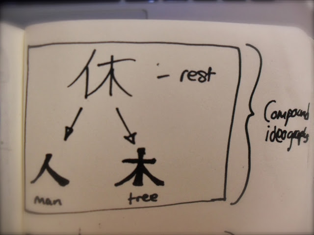
Compound Ideographs
The characters for "woods" and "forest" are compound ideographs- more than one symbol placed together to form another character. There are countless combinations with many different meanings.


The above example is the Kanji for rest, which is the combination of the character for "man" and the character for "tree" representing a person leaning against a tree, therefore taking a rest. From what I have seen, the origins of compound ideographs are pretty logical like this.

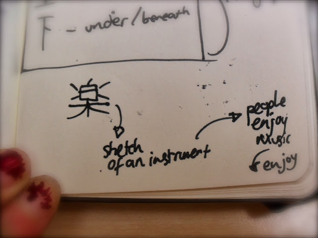
Derivative Characters
These are more indications than actual symbols; more like characters that relate to an idea rather than directly represent it. 


The above character means "to enjoy" however, because there isn't a pictorial representation of that, we have here in stead an abstracted version of a sketch of a musical instrument, and because people enjoy music, this symbol therefore can be derived to mean "enjoy. 

I personally find Kanji fascinating, as not only are there hundreds and thousands of characters with different symbolic qualities, but even more combinations of characters to be learned. 

Monday, 14 October 2013

14/10/13- Introduction to Musical Notation

Looking into the origins of musical notation, I have uncovered a lot about the development of musical symbols I was not aware of before, and most importantly, a lot of my findings have a pretty direct link to the topics we have already covered! 
Now, different sources have different versions of the history of music and its origins, and therefore it is very difficult to pinpoint the first ever use of symbolic notation to represent musical theory, but what is definite is that some of the first examples of such notation have been discovered in cunieform
The second of two hymns to Apollo written on the original stone
at Delphi. The musical notation is the occasional symbols above certain
parts of the Greek text
We know for certain that music has been around for hundreds of thousands of years, and even before instruments, we can be sure that the earliest humans must have experimented with sounds and tones- it is just part of our nature. The problem is that wood rots very easily, so the earliest instruments will have been lost through the years, but the earliest form of instruments to be discovered to date are simple flutes made from bone and ivory, dating 42,000-43,000 years ago, found in Germany. This is prior to the concept of notation, however, when music and ideas were passed down through generations, so it is likely we will never know what the earliest forms of music actually sounded like.


It seems unclear which is the definite earliest forms of musical notation, as across the world there were independent communities finding their own methods and symbols to understand music, all of which are very different to the universal notation we use and understand in the present day.

Tuesday, 8 October 2013

08/10/13- The Initial Lectures


Week 1
So far we have had three contextual lectures, illustrating the progress and development of human communication starting off with “The Birth of Symbolic Language”, from the very beginning of human existence, right through to the idea of online personas, texting and emailing, so I think it’s fair to say we covered a lot. What particularly captured my interest initially was the Chauvet Caves, examples of prehistoric cave art which were open for interpretation- while some believe they are informative and for descriptive uses to convey lessons in hunting, others see them as evidence that the early homo sapiens were not in as much danger as it is commonly conveyed, and they had time for storytelling and had the capacity for fantasy and imagination. Meanwhile, it was pointed out that the more abstract and symbolic Bhimbetka Cave Painting in India displayed signs of possible ordering and maybe even the concept of movement, or “animation”. This made me think of the 2003 Disney animation “Brother Bear”, which seemed to have picked up on this idea. It contains several scenes where the animal spirits, styled around the imagery in famous cave painting sites, are seen in the northern lights and are spiralling and circling, much like you would imagine the cave paintings to move. It is pleasing to think that ideas and images that were not possible to express thousands of years ago are now being conveyed countless generations later, using the resources we now have.
Chauvet Cave, FranceVery pictorial and descriptive,
with 13 types of animals in total

Bhimbetka Cave Painting, India
Symbolic and abstract, possibly markers
for travelling, with more human figures

Screenshot from "Brother Bear" 2003
After that, the main theme of our discussions was development through abstraction, and the idea that while humans became more advanced our languages and symbols required more learning, due to the simplification of the imagery.
One of these semi-symbolic languages is the Cuneiform script, which uses images and condenses them into structured grids of symbols. Evidence of the development of this system were found in Sumer, in the form of Mesopotamian 9000 year old 'trading tabs' as well as larger tablets. 
Sumerian Inscription, 26th Century B.C
Cuneiform was usually printed into wet clay, or 
sometimes carved.

This idea of structure and grid work struck a chord in me, reminding me of the way music is notated, begging the question of how written music came about, especially taking into consideration the fact that the musical language doesn't have an image to abstract from, unlike the cuneiform scripts themselves.
It is certainly worth considering. 

Week 2
A week later we explored Cognition- the process of making sense out of what is perceived. This was also the week I was in the discussion group, so it was important that I understood what was going on.
List of Sumerian Gods and Deities, 2400 B.C
Our main topic was Semiotics/Semiology, the process of signs and the processes behind them. Part of this was understanding that humans are especially good at understanding abstracted and simplified images, for example the human face. 
The above image is a circle containing two dots
 and a straight line, yet due to psychology
 we automatically perceive it as a face.


Seeing faces in objects or inhuman things is known as Pareidolia. We touched on the question as to why we do this, and weather it is hardwired in our brains, and I mentioned the idea that we are best suited to understand and convey emotion biologically due to the fact we over all animals have more whites in our eyes. I may not have conveyed the idea correctly, so I decided to do some more research on the matter to back it up.
The reason we identify human faces so easily is partly due to the fact that the human face is the very first thing we can actually see as a baby. Between birth and four months, a baby can only focus on what is 8-10 inches away from it, which is mainly the mother's face while breast feeding, therefore we learn to detect faces from a very early age. This is a very useful thing for humans to do, considering that we are a co-operative race, so to be able to convey and understand emotion is invaluable to us, as is detecting the gaze of another human, which brings us back to my original point. Predators which depend on their ability to not be detected usually have very little whites in their eyes, so that their gaze is not picked up by their prey; meanwhile, recent studies show that through the action of human eye morphology, humans have uniquely white scleras (the area of the eye that borders the iris), and this is no accident. This is to allow us, at a glance, to ascertain the direction of another person's gaze, and to make our own gaze clear to others. There are also neurons in our brains that become active when someone is staring directly at us, and become inactive even if the gaze is shifted by a few degrees, therefore, humans are very sensitive to direct gaze, as long as the other person's eyes are somewhere within our line of sight. There is actually a fear of being stared at, called Scopophobia. So in conclusion, Pareidolia is indeed biological and fundamentally important to the communication between humans.    

We also covered the categorising and identifying the different kinds of symbols, like Icons, Indexes and Symbols. This is where it gets a bit more difficult, as some symbols fit into more than one category, and it can be hard to define the line between abstraction and resemblance.
My own attempt at identifying symbols and the thoughts they automatically trigger.
Symbols are usually a very abstracted form of a visual image, so what about musical notes?
It seems I'll have to do some investigation into musical notation.